One kit for the new LanderLab: the dashboard, the editor and the AI tools.
Design system LanderLab · PaperClicks 2025–2026
In 2025 LanderLab, the AI landing-page builder, got a new dashboard and a new editor. I designed the system under both in Figma. It is light and calm: lavender surfaces, one blue for actions, and a soft violet glow that marks every AI moment. Every board below is built from the real screens in the product file.
- Role
- Product designer
- Years
- 2025 – 2026
- Size
- 50+ components
- Tools
- Figma




Colour
Ink and lavender. Text is a cool ink, not pure black. Surfaces and lines are a very light lavender, so the app never looks grey.
One blue. Blue #266BF5 is for actions. Lighter blues show data and the light buttons.
Signals. Green goes up, red goes down, violet means AI and gold means rewards. Each quick action gets its own soft tile.


Type
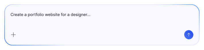
Two families. Lato carries the interface: titles, buttons and the editor panels. Inter carries the data: tables, cards and the prompt box.
A short scale. Nine styles, from a 32 px page hero down to 12 px labels. Most of the app is 14 px.
Corners and depth
Small parts, small corners. Fields get 2 px, cards and modals 10 px, the hero 30 px. Chips are pills.
A line before a shadow. Cards sit on a 1 px lavender line. Only things that float get a shadow. Focus gets a soft blue glow, and AI a violet one.
Icons
One outline set. Icons are 24 px with a 1.5 px stroke and round ends. The active one turns blue on a light blue tile.
 Add
Add Layers
 Style
Style Select
 Files
Files Settings
 Code
Code Image
Image Video
Video Dashboard
 Pages
Pages Templates
 Reports
 Analytics
 Domains
 Workflows
 Docs
Docs Support
 Ask AI
 Rewards
 Clicks
 Integrations
 Invite
 Text
TextButtons and chips
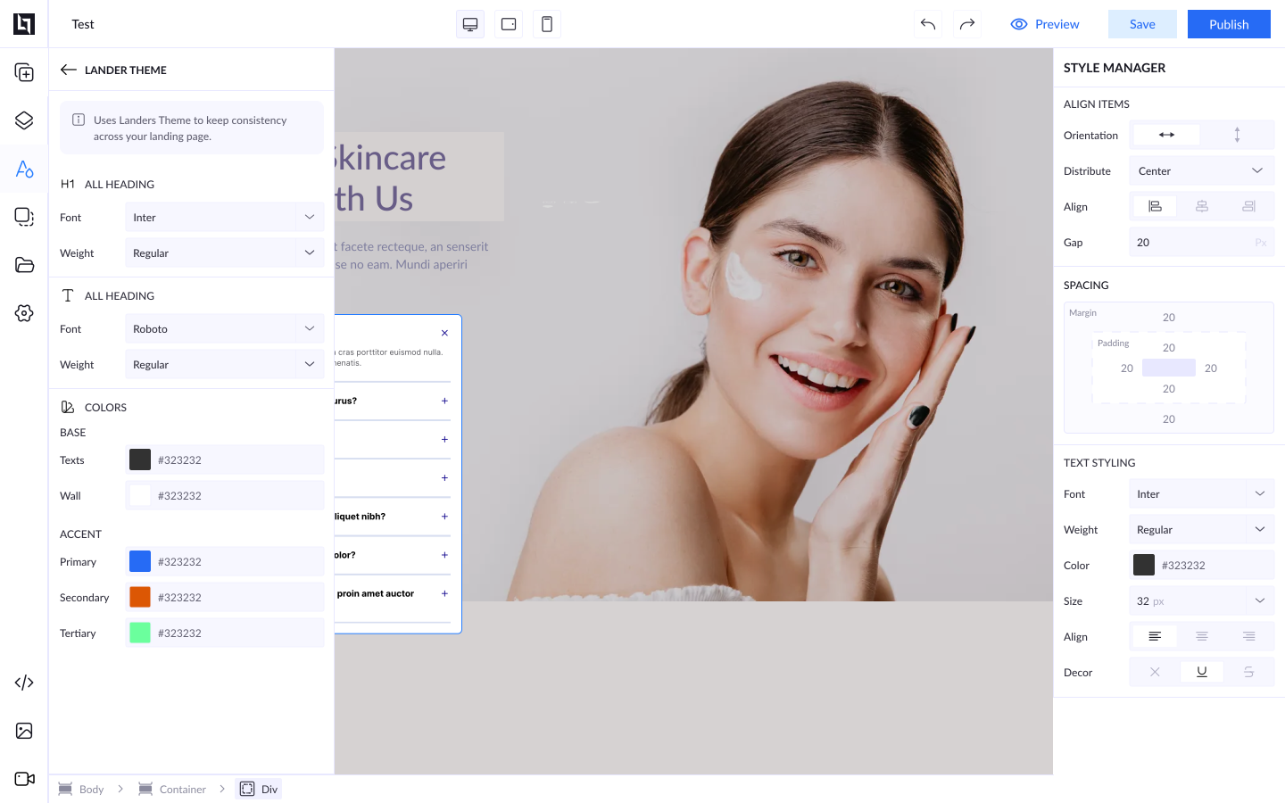
One primary per bar. Publish is the only filled button in the editor bar. Save is light blue and Preview has no background.
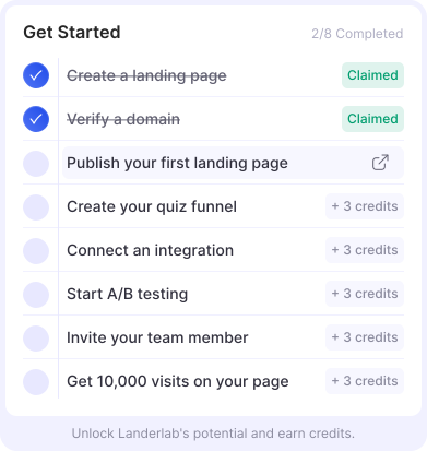
Chips. Credits, Ask AI, New, Claimed and “+3 credits” say a lot in a few letters.



Cards and data
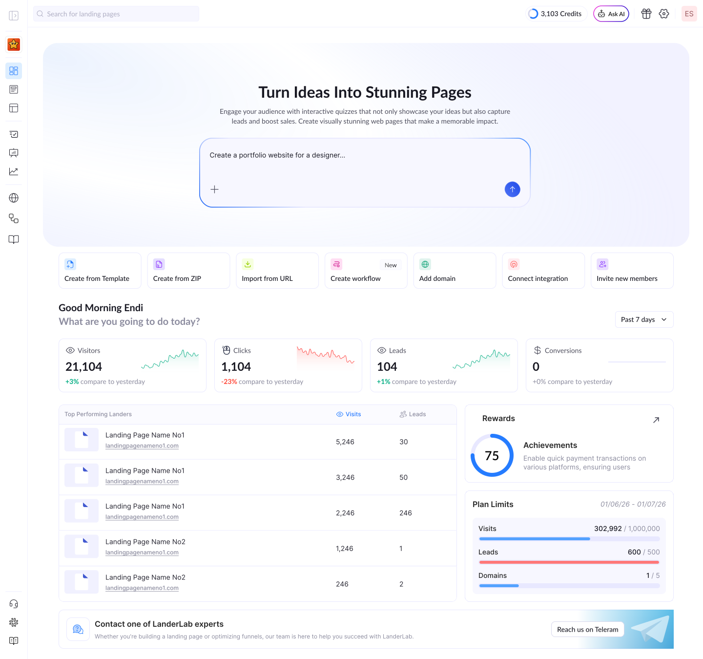
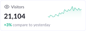
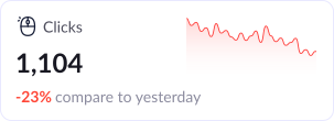
Numbers first. A stat card shows the value, the change against yesterday and a small line chart. Up is green, down is red.
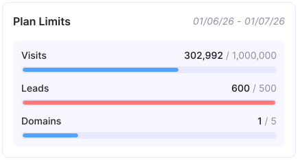
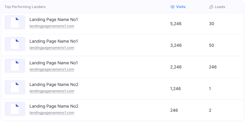
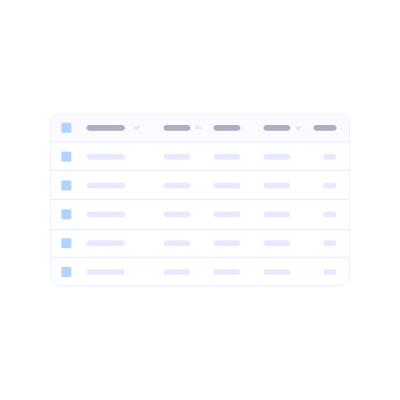
Limits and tables. A limit bar turns red when you pass your plan. Table rows are set in Inter, and the sorted column turns blue.
Editor controls
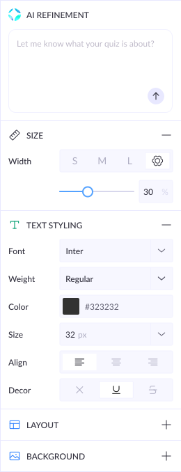
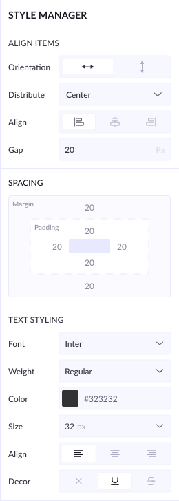
Label left, control right. Every row in the editor panel is 32 px: a label, then a select, a segment group, a slider or a colour field.
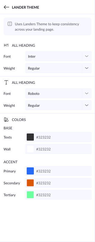
One theme. Lander Theme sets the fonts and colours for the whole page in one place.
Popups and empty states
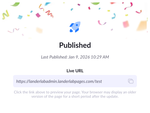
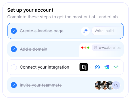
One job each. A popup does one thing: it shows the live link, or it lists the next steps and the credits they pay.
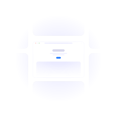
Empty, but not blank. Light line drawings in the same lavender show what will appear on the page.


AI
A glow means AI. The prompt box, AI insights and AI refinement share a soft glow and a gradient edge, so people always know where AI can help.
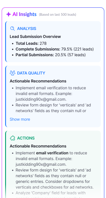
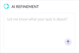
Ask AI sits in the top bar on every screen, with a pink-to-blue edge.
Achievements
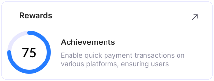
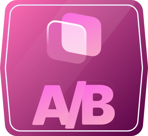
Badges to earn. Each goal has its own glass badge. It stays lavender until you earn it, then the colour arrives.






Put together
The dashboard. The prompt box, quick actions, stat cards, a table and rewards, all from the kit.
The editor. The top bar, Lander Theme and the style manager around the page you build. One shared library is a big part of why development on LanderLab got 72% faster.